Learning HTML Part Four
Picking up where part three left off, this post will walk through various types of input forms. Again, this series is meant to document some of my learning, not be a complete reference material.
The point of HTML input forms is to provide a means to get data from a user. The type of input form used will vary based on a number of factors and this post will show some possibilities.
Form/Input/Fieldset
The first element required in order to get input from the user is the form element. The purpose of the form element is to enclose other input controls. The behavior of those nested elements is then further defined by the attributes of those nested elements. Again, this post will by no means be an exhaustive list of everything that is possible, but highlight some common patterns.
Within a form element, just about any element can appear, with the exception of another form element. That means that the text within a form can be structured just like it was a part of any other section of the document. The most common attributes of the form element are action and method. The action attribute specifies where the data is sent. We’re prompting the user for data. Presumably, the desire is to save it somewhere, and this is how that is saved. The method attribute tells the form which HTTP method to use.
The input element is used to create various types of input mechanisms on a page. The fieldset element is used to group related input items together.
This is tough to visualize without looking at a specific input type. Let’s jump into that next.
Text/Password
A common use of forms is to prompt a user for a username and a password to login to a site. Below is a basic form to prompt a user:
<h2>Log In to My Account</h2>
  <form action="https://httpbin.org/post" method="POST">
    <fieldset>
      <p>
        <label for="userName">Username:</label>
        <input type="text" name="userName" id="userName" placeholder="Enter your username here" autocomplete="on" required autofocus>
      </p>
      <p>
        <label for="password">Password:</label>
        <input type="password" name="password" id="password" placeholder="Enter your passwor here" autocomplete="on" required>
      </p>
    </fieldset>
  </form>
This renders on a browser as follows:
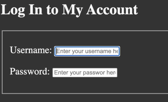
This introduces the label element which hasn’t been covered yet and does two important things:
- Provides a description for the control (the text “Username:” and “Password:” is within the label)
- Links to a form element via the
idattribute
The input element has some interesting attributes, the first of which is type. This attribute has several different possible values, many of which will be covered later in this post. The two used here are text (the default value if none is provided) and password. The only difference between these is that the password attribute hides the text that is typed.
When form data is submitted, it is done by submitting name/value pairs. With this in mind, the data in a form element is the value, while the name attribute corresponds with the name. This differs from the id attribute, which pairs a label with an input and provides a way to uniquely identify an input on a page.
Another thing to notice is that the placeholder text which appears in the inputs on the screen does not fit. This can be adjusted in several ways, the easiest of which is to use the size attribute, which defines how many characters will be displayed in a field.
The fieldset attribute is what produces the outline around the login form which may or may not be desirable. In practice, div tags are more commonly used to enclose the type of data. The reason being is that they allow for full control of the styling that can happen when the page is rendered. The fieldset element can be interpreted differently by each browser, giving users an inconsistent experience. Still, the fieldset element is useful in structuring a page and definitely has its place.
Tel/Number
Both tel and number are possible values for the type attribute of the input element. The tel value is used to input a telephone number and has a somewhat special purpose: on touchscreen devices, this allows for a more appropriate virtual keyboard to be presented to the user to type a phone number. The form will also not be submitted if text was input into this field.
A number value is used in order to prompt a user to enter a number of some kind. Bounded values can be put in place to limit the user input. Think of the quantity of items needed when checking out of an e-commerce site.
<h2>Tel/Number Inputs</h2>
  <form action="https://httpbin.org/post" method="post">
    <p>
        <label for="phone">Phone:</label>
        <input type="tel" name="phone" id="phone" placeholder="Your phone number" autocomplete="on" required pattern="\[0-9\]{3}\[0-9\]{3}\[0-9\]{4}">
    </p>
    <p>
        <label for="quant">Quantitiy</label>
        <input type="number" name="quant" id="quant" min="1" max="10" step="1" value="0">
    </p>
  </form>
The tel input further allows via the pattern attribute for a regex to check the input received to make sure it’s in the right format.
The interesting attributes on the number input are below:
min: minimum possible inputmax: maximum possible inputstep: how much to increase/decrease with each mouse clickvalue: initial value to display
The above code renders this on a page:
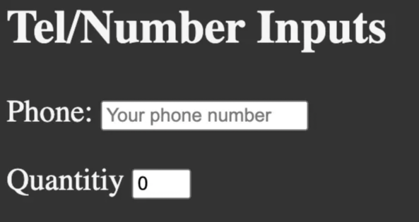
Notice that the fieldset element wasn’t used in this example, so there isn’t a box around the input. The rest of the examples in this post will be rendered without it.
Select
The select form element produces a different type of input than we have seen thus far. Let’s jump right into some code and how it renders:
<h2>Select Input</h2>
  <form action="https://httpbin.org/post" method="post">
      <p>
          <label for="coffee">Favorite Coffee</label>
          <select name="coffee" id="coffee" multiple size="5">
              <optgroup label="Coffees">
                  <option value="regular coffee">Regular Coffee</option>
                  <option value="iced coffee">Iced Coffee</option>
              </optgroup>
              <optgroup label="Espresso Drinks">
                  <option value="latte" selected>Latte</option>
                  <option value="cappuccino">Cappuccino</option>
                  <option value="cortado">Cortado</option>
                  <option value="americano">Americano</option>
              </optgroup>

              <option value="other">Other</option>

          </select>
      </p>
  </form>
The above code renders this on a page:
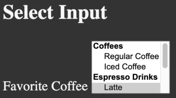
The first thing to notice and restate is that select is its own element and not an attribute on an input element. Part of the reason for this is because select has nested elements that help construct the input, namely optgroup and option elements. These do exactly what they sound like: optgroup groups similar options together (and provide a label if desired, ‘Coffees’ and ‘Espresso Drinks’ in the above code) and option defines an individual selection.
Radio
A radio input allows a user to select one option out of many. A simple example would be a favorite food:
<h2>Radio Input</h2>
  <form action="https://httpbin.org/post" method="post">
      <p>
          <input type="radio" name="food" id="tacos" value="tacos">
          <label for="tacos">Tacos</label>
      </p>
      <p>
          <input type="radio" name="food" id="pizza" value="pizza">
          <label for="pizza">Pizza</label>
      </p>
      <p>
          <input type="radio" name="food" id="other" value="other">
          <label for="other">Other</label>
      </p>
  </form>
The above code renders this on a page:
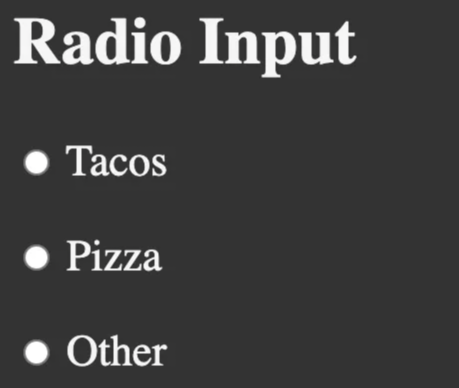
There isn’t much to talk through here that is wildly different from other input options that have been covered. radio is again an attribute on the input element and uses the label element to put text alongside the radio button.
Checkbox
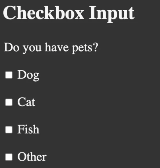
The checkbox input is functionally equivalent to the radio input with one important and obvious exception: multiple inputs can be selected. The code looks very similar:
<h2>Checkbox Input</h2>
  <form action="https://httpbin.org/post" method="post">
      <legend>Do you have pets?</legend>
      <p>
          <input type="checkbox" name="pets" id="dog" value="dog">
          <label for="dog">Dog</label>
      </p>
      <p>
          <input type="checkbox" name="pets" id="cat" value="cat">
          <label for="cat">Cat</label>
      </p>
      <p>
          <input type="checkbox" name="pets" id="fish" value="fish">
          <label for="fish">Fish</label>
      </p>
      <p>
          <input type="checkbox" name="pets" id="otherPet" value="otherPet">
          <label for="otherPet">Other</label>
      </p>
  </form>
The above code renders this on the browser:
TextArea
The textarea input is its own element as select was. It provides exactly what it sounds like: an area for a user to type in. The size of that area is controlled via attributes on the textarea element.
 <h2>Textarea Input</h2>
    <form action="https://httpbin.org/post" method="post">
        <label for="message">Your message:</label>
        <br>
        <textarea name="message" id="message" cols="30" rows="10" placeholder="Type your message here"></textarea>
    </form>
The above code renders this on the browser:
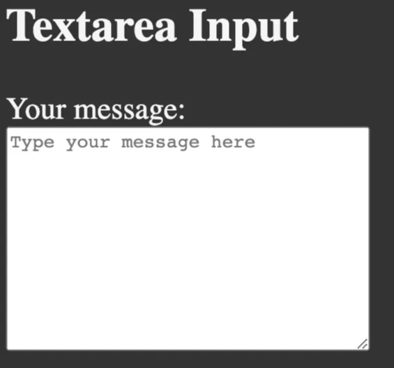
The size of the area viewable to the user is defined by the cols and rows attributes on the textarea element.
Submit/Reset/Button
There’s no point in having any of these inputs unless the user is provided a means to send them somewhere. Enter buttons, and we’ll just cover the submit button here. Let’s add a submit button to the previous textarea input:
<h2>Textarea Input</h2>
  <form action="https://httpbin.org/post" method="post">
      <label for="message">Your message:</label>
      <br>
      <textarea name="message" id="message" cols="30" rows="10" placeholder="Type your message here"></textarea>
      <br>
      <button type="submit">Submit</button>
  </form>
The above code renders this on the browser:
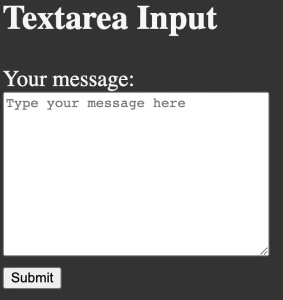
The new element here is appropriately named button and it renders a clickable button on the browser:
This button will take the data input into the form and submit it to the location defined in the action attribute of the form via the method defined in the form.
Wrap Up
That’s it on HTML input forms. Thanks for reading!